There’s something about old neon signs that commands attention. That’s the point, obviously: These glowing advertisements were built to stand out among other businesses also vying to attract your eyeballs. But part of the reason you crane your neck as you drive by a particularly flashy vintage sign is their rarity—there just aren’t a lot of them left. Rather than pay the pricey upkeep costs, many businesses replace dilapidated neon with backlit plastic signs that don’t have an ounce of the personality and style of their tubular predecessors.
Nick Freeman, author of Food, Lodging & Liquor: Signs You’re in Chicago, shares that fascination with old neon—so much so that the St. Charles native spent six years photographing the relics for his self-published coffee-table book (which, unfortunately, is not yet commercially available). “The fragility of glass tubing continuously exposed to harsh Chicago weather makes the survival of an old sign a kind of urban miracle, deserving, at the least, of photographic preservation,” Freeman says in his foreword. We couldn’t agree more: In this issue, you’ll see Freeman’s photographs mixed with our own, all showing off the beauty and flair of the city’s and suburbs’ brightest neon stars. —Laura Baginski
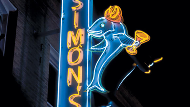
1 | SIMON’S TAVERN (5210 N Clark St, 773-878-0894)
When owner Scott Martin bought the Depression-era tavern in 1994, he found photographs that helped him replicate the original, 40–50-year-old vertical sign with the bar’s name, which he remembered from his childhood in Andersonville. But he added one element: a martini-drinking fish (a pickled—as in drunk—herring), designed by John Diaz, a non-Swedish member of Martin’s dad’s Swedish glee club and card-playing group, the Royal Order of the Pickled Herrings.
2 | YORK THEATRE (150 N York St, Elmhurst, 630-834-0675)
The porcelain-clad, plated steel sign at this 1924 picture palace dates back to 1937–38 and was restored by current owner Willis Johnson in the early ’90s after purchasing the York in 1984. He also renovated the building’s facade to complement the marquee’s late-1930s look, changing only the old-school “attraction” boxes, which are now LED panels. “We enjoy it,” Johnson says of the marquee. “You look at it and it says theater.”
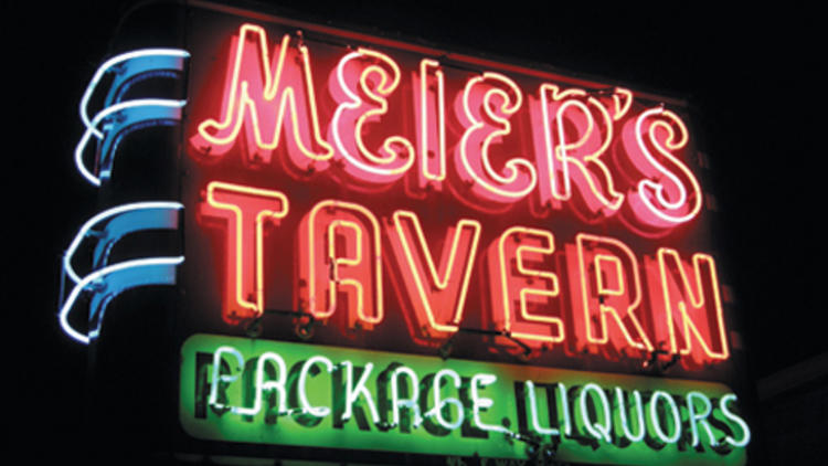
3 | MEIER’S TAVERN (235 E Lake Ave, Glenview, 847-724-0477)
The 50- to-60-year-old sign at this farmhouse—which became a speakeasy in 1927, was purchased by the Meiers in 1932, and turned into a tavern in 1933—is entirely handmade from blown glass with starter flames inside that light up. Louis Pappas, son of the current owners, says it sometimes shorts out in high humidity and that snowplows kick up ice that breaks the glass, making its per-month maintenance cost $100.
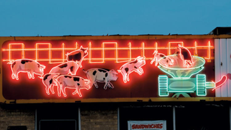
4 | ROSARIO’S ITALIAN SAUSAGE (8611 S Pulaski Rd, 773-585-0660)
“We’ve gotten hate mail,” admits owner Kathy Salus of the sign, which depicts cavorting pigs leaping into a grinder and coming out as encased meats that spell sausage. Salus’s father designed it in 1965, when he and her mother (who began making sausage at home in 1955 and selling it through newspaper classifieds) bought their current building in the Ashburn neighborhood, and the sign went up in 1968. Salus added a protective Plexiglas shield to the sign in 1996, but later removed it because it diminished the sign’s visibility.
5 | ERIE-LASALLE BODY SHOP (146 W Erie St, 312-337-3903)
“The car is a Plymouth,” says owner Bob Gottfred, referring to the souped-up neon ride. He’s gotten numerous offers to buy the 1957 sign, mainly from passing tourists who have a nostalgic affection for retro neon. But he has no plans to part with the porcelain and neon monument, which can’t be reproduced because companies he’s researched no longer work with porcelain. “I got one offer for $30,000,” he says. “It didn’t faze me.”
6 | SEVEN DWARFS (917 E Roosevelt Rd, Wheaton, 630-653-7888)
“It’s a landmark; it’s beautiful,” says Sam Sadiku of the 59-year-old sign at the family restaurant he’s owned for 32 years. “But the city wants it to come down because the letters don’t work right.” Sadiku hopes that someone reading this knows how to fix its five transformers and gives him a call. We might know someone.
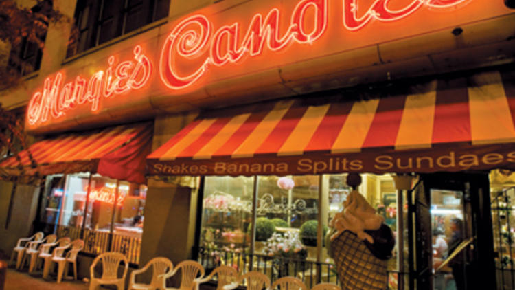
7 | MARGIE’S CANDIES (1960 N Western Ave, 773-384-1035)
“It cost $3,500 at a time when a Cadillac Fleetwood cost $3,200,” says owner Peter Poulos (grandson of 1921 founder Peter and son of the namesake Margie) of the porcelain-over-metal and neon creation that’s graced the Bucktown confectionery since 1954, replacing the family’s first foray into electric marketing, a 1940s Coca-Cola sign. When Poulos recently opened a second location on Montrose Avenue, he attempted to commission an identical sign but gave up upon discovering it would cost $17,500 and be made with painted aluminum instead of porcelain, which Poulos feels would diminish its beauty.
8 | THE CHOO CHOO (600 Lee St, Des Plaines, 847-391-9815)
It’s the original sign for the diner (where burgers exit the kitchen in a model train car), which opened in 1951—four years before and down the street from the original McDonald’s. It wasn’t working when current owner Jean Paxton bought the place in 2001, so she had it restored. “Whenever I’m having a bad day, I look at the sign. It’s so beautiful, I forget all my problems,” she says.
9 | SMITHEREEN PEST MANAGEMENT (10753 W Grand Ave, Northlake, 847-455-0043)
The family business began 123 years ago, and the sign, designed by third-generation owner Richard Jennings in the 1950s, has been moved from locations in Chicago, Skokie and Niles to its current home. Sales and marketing director Steve Seifert says the giant rat “draws both criticism and praise, which in this business is exactly what you’d hope for.”
10 | HI-WAY BAKERY (2633 Chicago Rd, Chicago Heights, 708-754-3255)
Former owner Sylvia Del Cato (who was born in a cabin on the property and inherited the now-75-year-old business from her father in 1950) may be the inspiration behind this sign, which was installed in 1949. Current owner John Koester recently discovered that the chef in the sign is a lady—look closely and you’ll see she’s wearing an earring.
11 | HEART O’ CHICAGO MOTEL (5990 N Ridge Ave, 773-271-9181)
It flickers from red to blue and has been in place since 1957, when owner Scott DeGraf’s father, a concrete contractor, inherited the lot (after a client skipped out on a bill) and then built the motel. While the electricity and neon have been replaced, it remains visually exactly as installed. DeGraf, who has unsuccessfully attempted to trace the sign’s manufacturer, says that despite its Edgewater location near “Hot Sheets Row,” a string of seedy motels on Lincoln Avenue, his clientele is mostly out-of-town sports fans who want their pictures taken under the sign.
12 | DELL RHEA’S CHICKEN BASKET (645 Joliet Rd, Willowbrook, 630-325-0780)
The Chicken Basket opened in 1938 in a gas station on now-defunct Route 66, and the sign went up in 1946. When then-well-known hotel manager and Chicago Convention Bureau executive director Dell Rhea bought it in 1963, he added his name to the marquee. It was restored in the ’90s to its original colors, which had faded, and is currently being repainted to match.
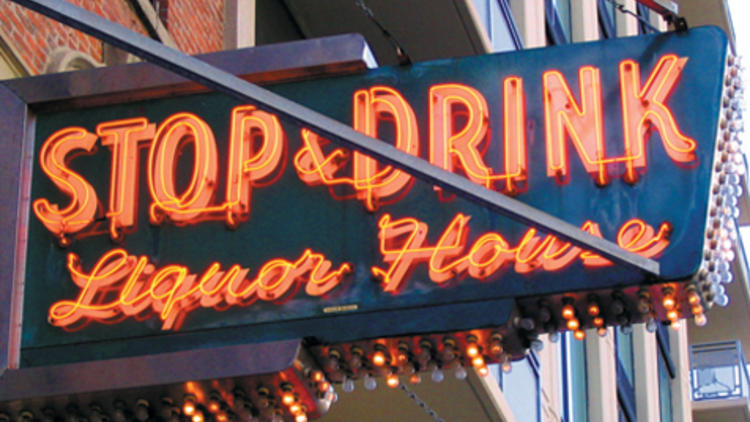
13 | CLARK STREET ALE House (742 N Clark St, 312-642-9253)
When owner Adam Ellis purchased River North’s Stop and Drink bar in 1994, its sign (which dates back to 1949) wasn’t working. Renovations, which took a year to complete, included all-new neon and blinking chase lights.
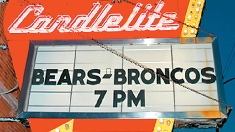
14 | CANDLELITE CHICAGO (7452 N Western Ave, 773-465-0087)
“When it’s on, people know we’re open,” says manager Pat Fowler of the sign, which was installed during the West Rogers Park bar’s 1954 opening and still features the original neon. When Candlelite closed in 2001 for two years’ worth of renovations, Fowler says they changed everything but the sign. “The contractors joked that we cared more about the sign than the bar,” he says. “But it was a no-brainer to keep it.” Become a regular and they’ll post birthday and anniversary greetings to you on the accompanying letter board.
15 | ORANGE GARDEN (1942 W Irving Park Rd, 773-525-7479)
The trademark Art Deco sign and its companion window neon were installed in the 1940s or ’50s to complement the exterior curved red walls and silver columns, in place since the North Center restaurant opened in 1932. Co-owner Julie Ruan, whose family bought Orange Garden in 1983, says that while changes have been made due to maintenance, the sign is still close to its original appearance.
16 | GONNELLA BAKING COMPANY (1001 W Chicago Ave, 312-733-2020)
The 1930s baked-enamel sign was originally mounted at the 2006 West Erie Street retail store, which opened in 1917 (the family-owned business began in 1886), and repaired after WWII. When the store closed 20 years ago and the building was converted into company headquarters, the sign—in poor working order due to patchwork repairs—came down. But the family loved it, so it was moved to the Chicago Avenue baking facility in West Town in 1994. It’s undergoing a complete restoration (and is expected to be reinstalled by the time you read this) by a craftsman who, upon dismantling it, discovered two bullets lodged in the sign.
17 | ZIMMERMAN FORD (2525 E Main St, St. Charles, 630-584-1800)
In 1963, founder Bill Zimmerman took research trips to Los Angeles and Las Vegas dealerships while developing his “starburst” sign, which debuted in 1964 and included a rotating pedestal (later changed to a stationary concrete slab). The original star remains, and Zimmerman’s son Jack has been resisting Ford’s attempts to replace it with something more modern.
18 | RAINBO CLUB (1150 N Damen Ave, 773-489-5999)
The exterior sign dates back to the Ukrainian Village bar’s 1935 opening as a Polish bar, which also featured an interior ring of red, blue and green neon glowing from atop the mid-wall-height paneling. Much of the interior lighting has since been replaced with LED, but the neon on the south wall to the left of the bar was accidentally restored this year when an employee cleaning 75 years’ worth of smoke and grime from the bulbs discovered they still worked.
19 | PETEY’S BUNGALOW (4401 W 95th St, Oak Lawn, 708-424-8210)
In 1965, owners Peter and Mary Kattos commissioned the marker from Grate Signs in Joliet because they wanted to make sure people knew that their supper club—which they opened in a converted Chicago-style bungalow in 1961—was actually a restaurant, not a house. Mary says the village later took action against installing new bright signs such as theirs, “but they didn’t pass that ordinance till 1970, so they couldn’t make us take it down.”
20 | PACIFIC GARDEN MISSION (1458 S Canal St, 312-492-9410)
The two-story sign at the South Loop Christian homeless shelter (in operation since 1877) was mounted in the 1920s at 646 South State Street (then Chicago’s Skid Row) as a can’t-miss beacon for the needy. During its tenure there, an over-the-sidewalk neon sign for the former 666 Lounge (at 666 S State St) appeared to hang directly under the huge neon cross.
21 | COLONIAL LODGE MOTEL (788 Villa St, Elgin, 847-742-2790)
This Las Vegas–style sign, which stands 60–70 feet tall, looks exactly the same as when it was constructed in 1955 except that it no longer rotates, which is against Elgin law anyway, says owner Joe Vanaria. He loves its uniqueness and ignores well-meant marketing advice to get with the times and install a Holiday Inn–style sign.
22 | THE FISH KEG (2233 W Howard St, 773-262-6603)
When Ted and Charlotte Hansen opened their Rogers Park seafood emporium in 1951, they designed a barrel logo for their shop. The original sign, which incorporated the logo, was installed in the mid-1960s. “Everyone loved that sign; people drove down the street looking for it,” says employee and nephew Tony Hansen. So when the metal sign became structurally fatigued beyond repair ten years ago, they had an exact replica made from the original blueprints.
23 | CENTRAL CAMERA CO (230 S Wabash Ave, 312-427-5580)
According to operator Albert Flesch, his grandfather Albert (who first opened shop in the Palmer House in 1899 and moved to the current Loop location in 1929) used this selection process for the colors on his sign, which went up in 1930–31: Green and white are the dominant colors because they are the store’s logo hues; Eastman Kodak founder George Eastman discovered that yellow (visible on the left side of the sign) is the color most identifiable from long distances; and red was an eye-catching choice for the flickering parts.
24 | BOOBY’S (8161 N Milwaukee Ave, Niles, 847-966-4733)
Founder Ronald “Booby” Friedman lives on in the 50-year-old sign, which features a caricature of his visage. The sign replicates the menu logo he commissioned when he and his wife, Sally, opened the restaurant in 1961. While Booby has passed on, Sally still comes in to work every day. “We get a lot of action from that sign,” she says, and we don’t doubt her. Who doesn’t want to say “Let’s get some Booby’s?”
